
Brand Identity · Not-for-Profit
Pink Chose MeBrand identity for a breast cancer nonprofit
A peacock showing its true colors, for a foundation built on freedom, beauty and kindness.
Client & scope
PinkChoseMe Foundation is the breast cancer awareness nonprofit founded by Tiffany Denee' Jones, who was diagnosed at 29 and is now a three-time survivor. The foundation works on early detection and prevention, education and youth outreach, and survivor support and community.
Design Land designed the logo and built the brand identity around it: logo system, color palette, typography and brand voice, a brand guidelines book with an editable SVG logo kit, and an Instagram launch campaign.
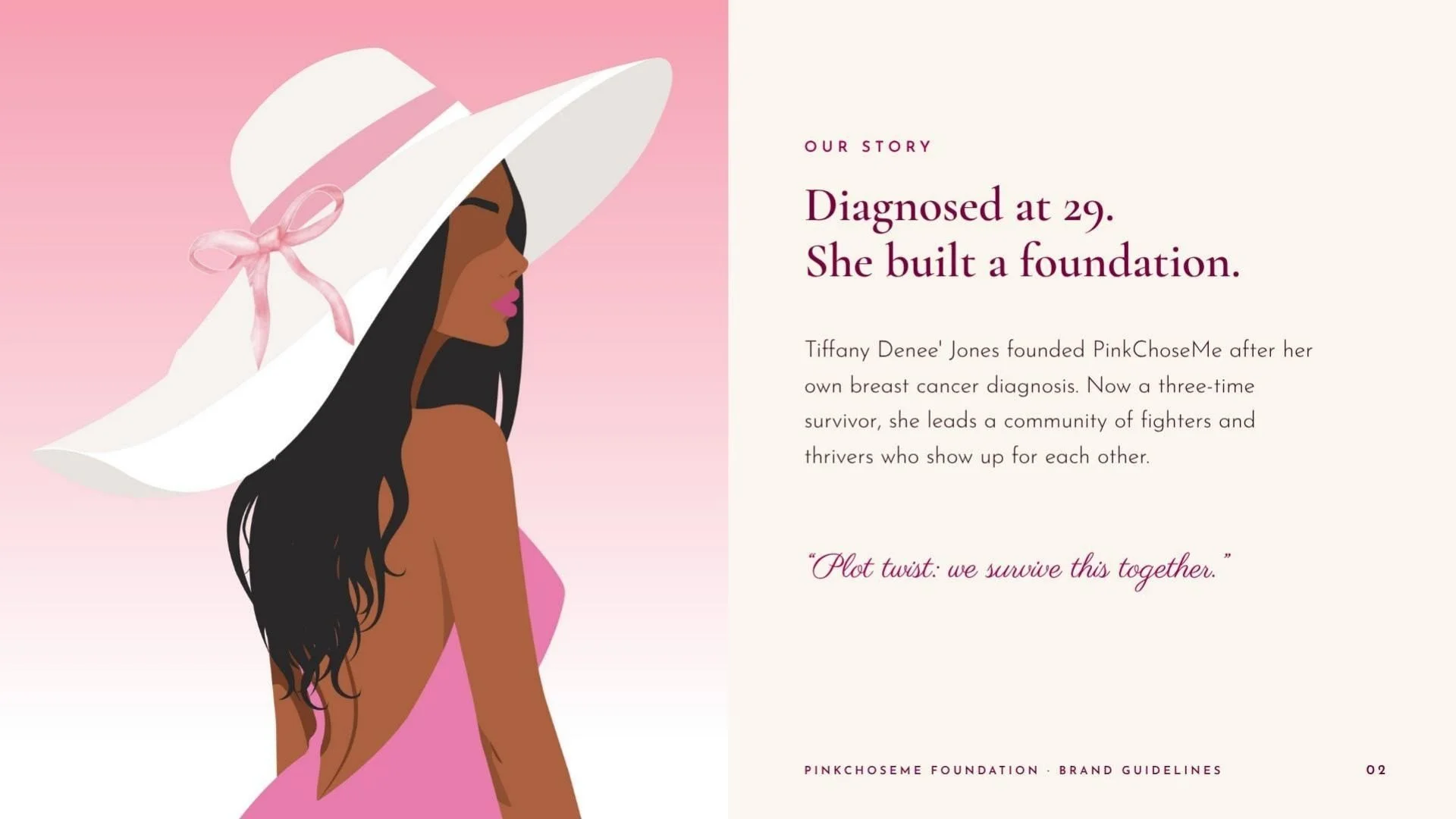
“Plot twist: we survive this together.”Tiffany Denee' Jones, founder
The brief
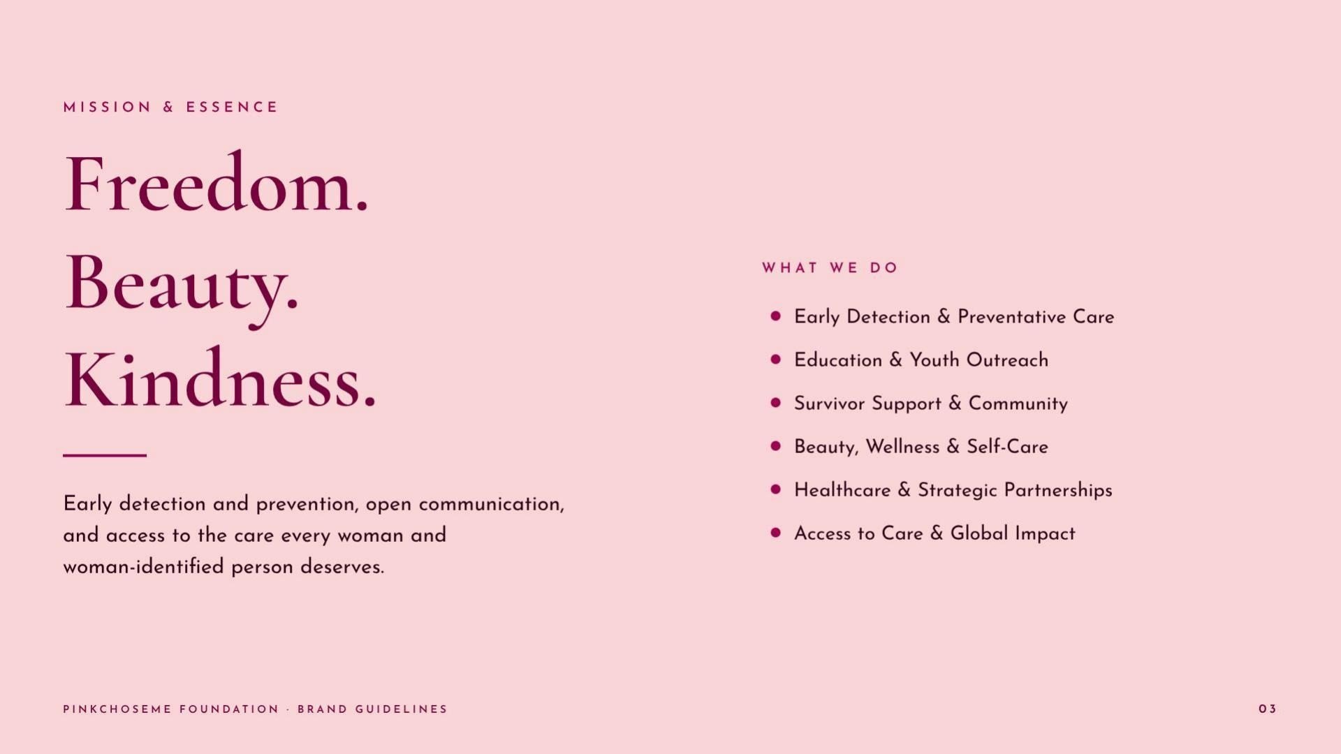
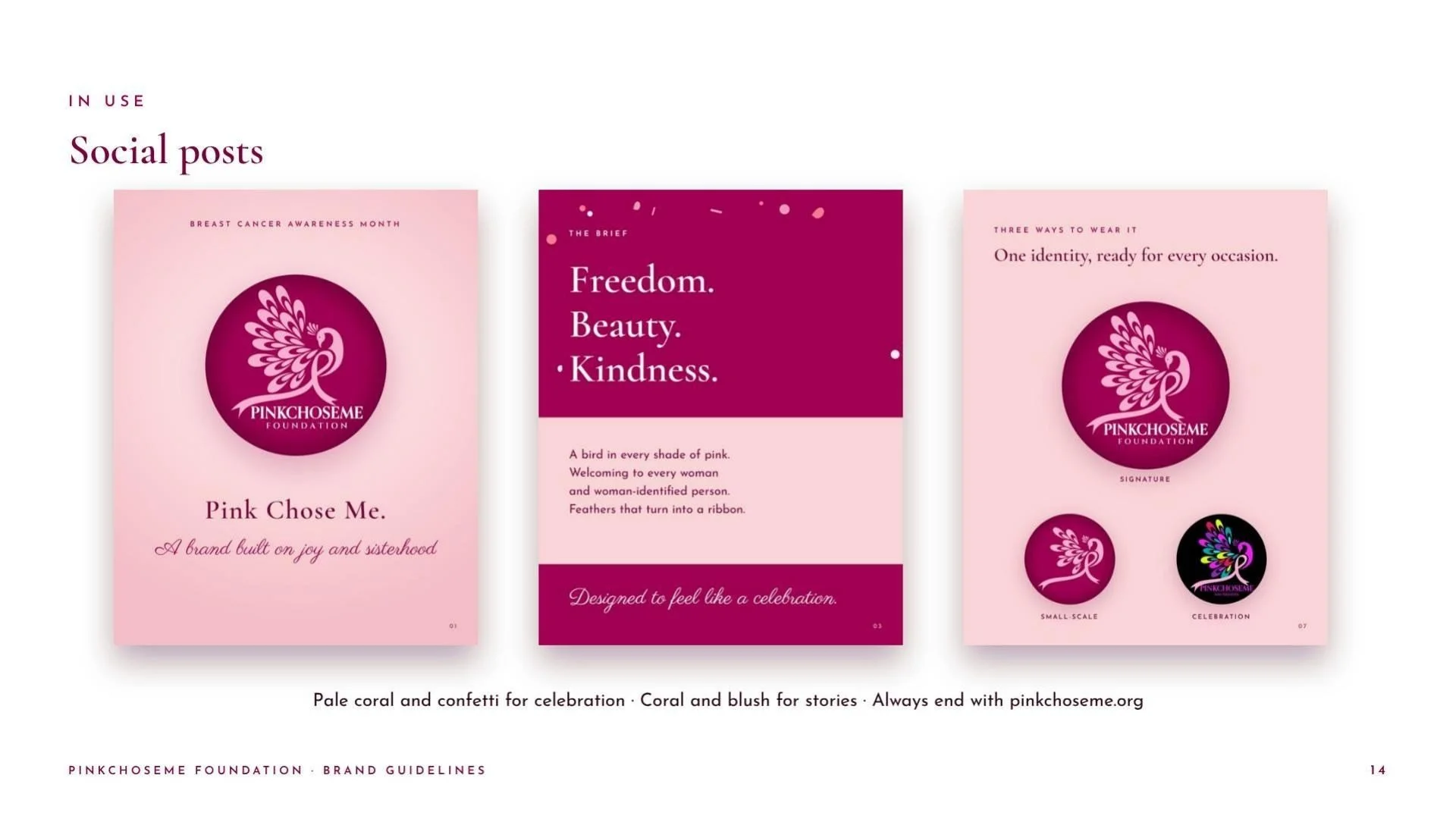
Tiffany's brief was three words: Freedom. Beauty. Kindness. Breast cancer branding usually defaults to a lone pink ribbon, which reads like a warning. She wanted a brand that feels like a celebration: joyful, confident and welcoming to every woman and woman-identified person.
What we did
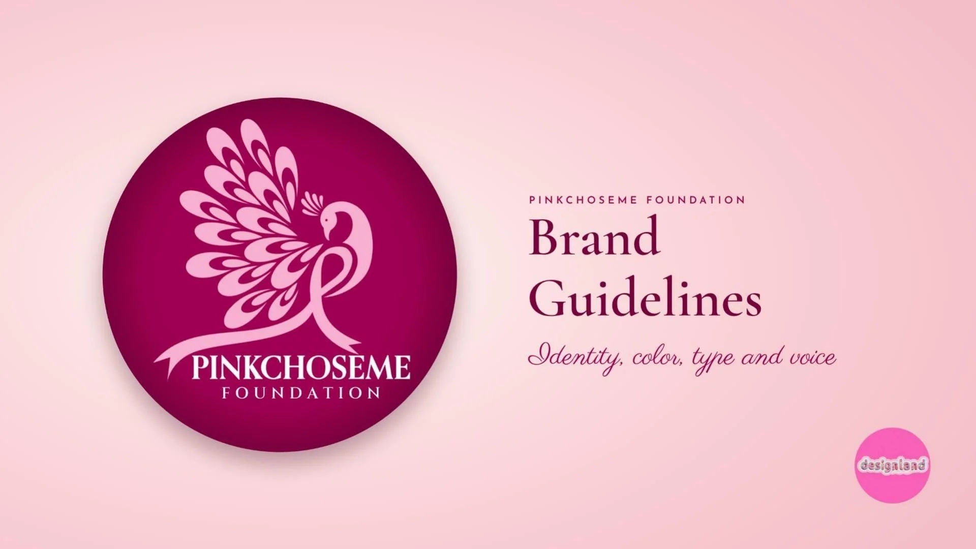
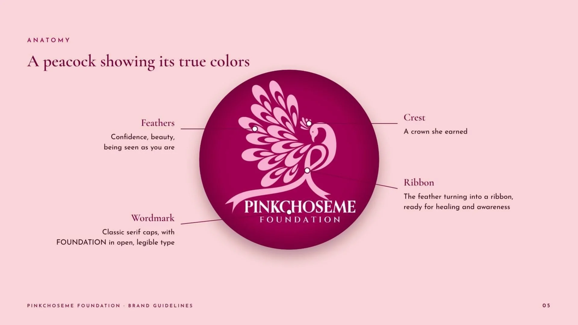
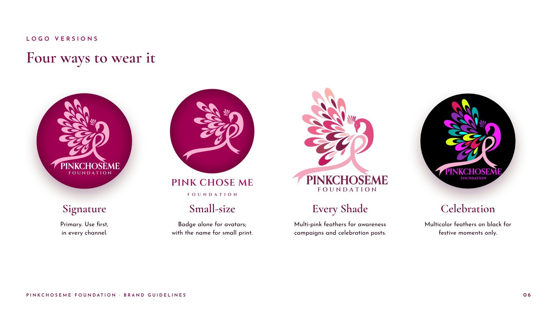
We drew a peacock showing its true colors: a bird in every shade of pink whose feathers turn into the awareness ribbon, ready for healing and awareness, set in a magenta badge over a classic serif wordmark. The mark comes in four versions: the signature badge, a small-size mark with fewer feathers for avatars and small print, Every Shade, with multi-pink feathers for awareness campaigns, and a multicolor Celebration badge.
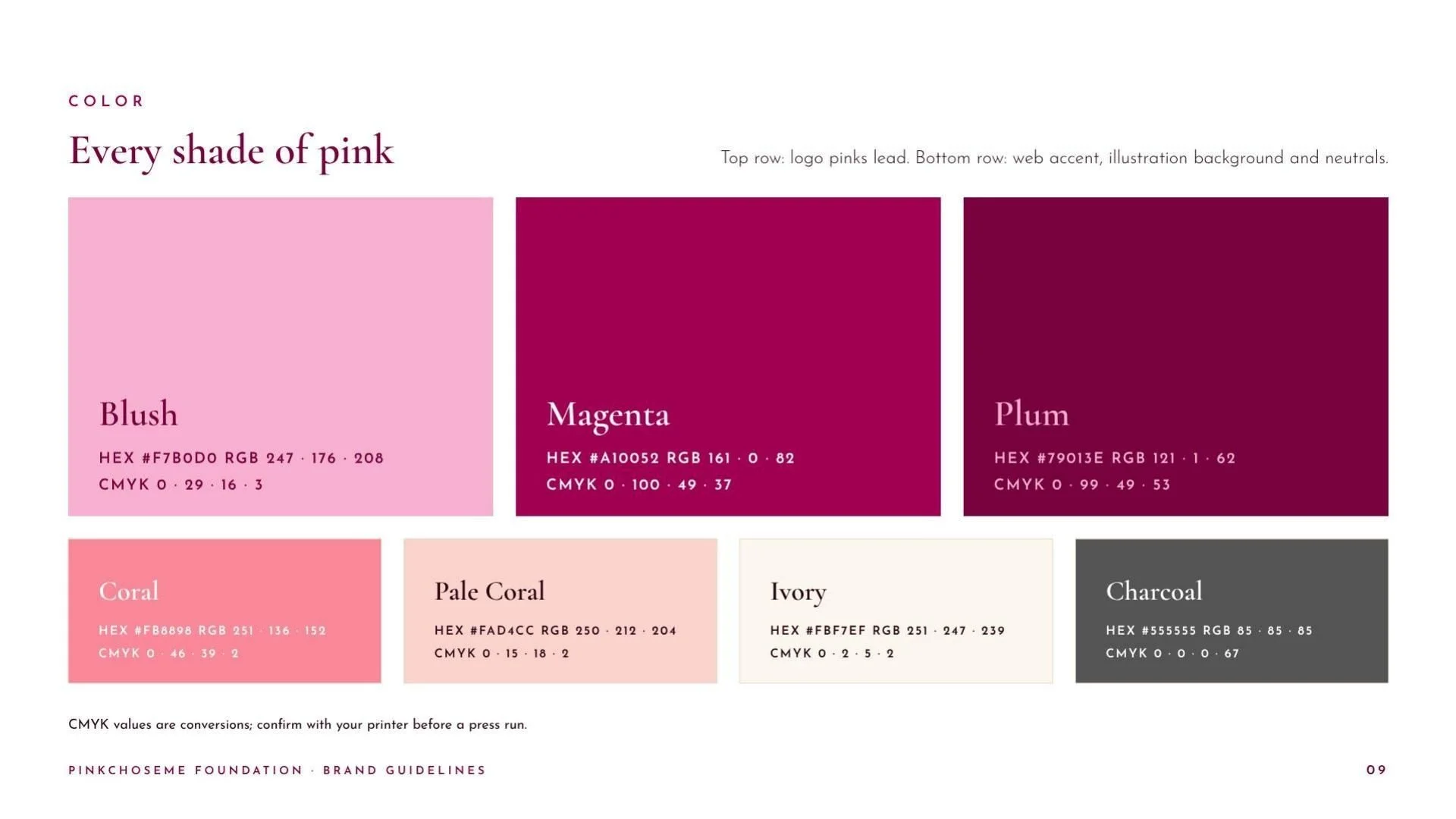
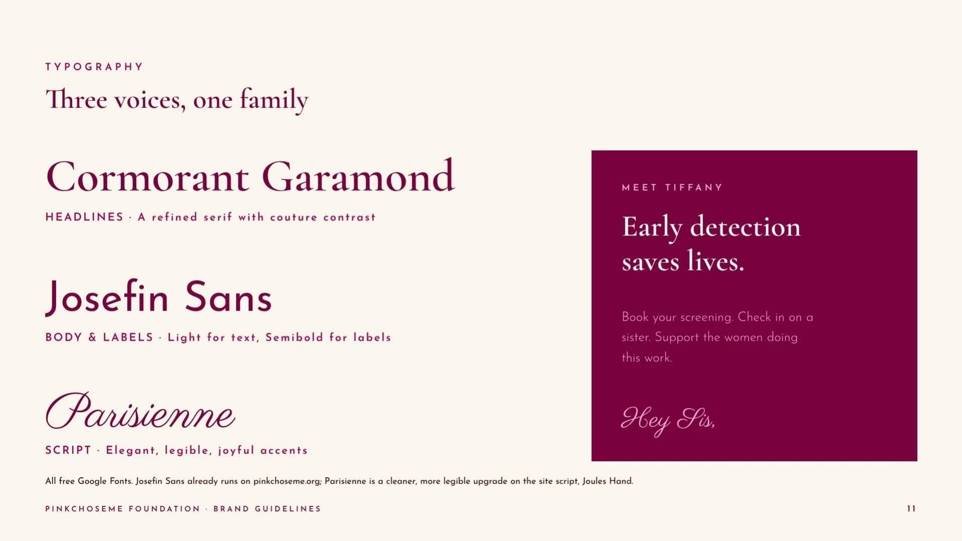
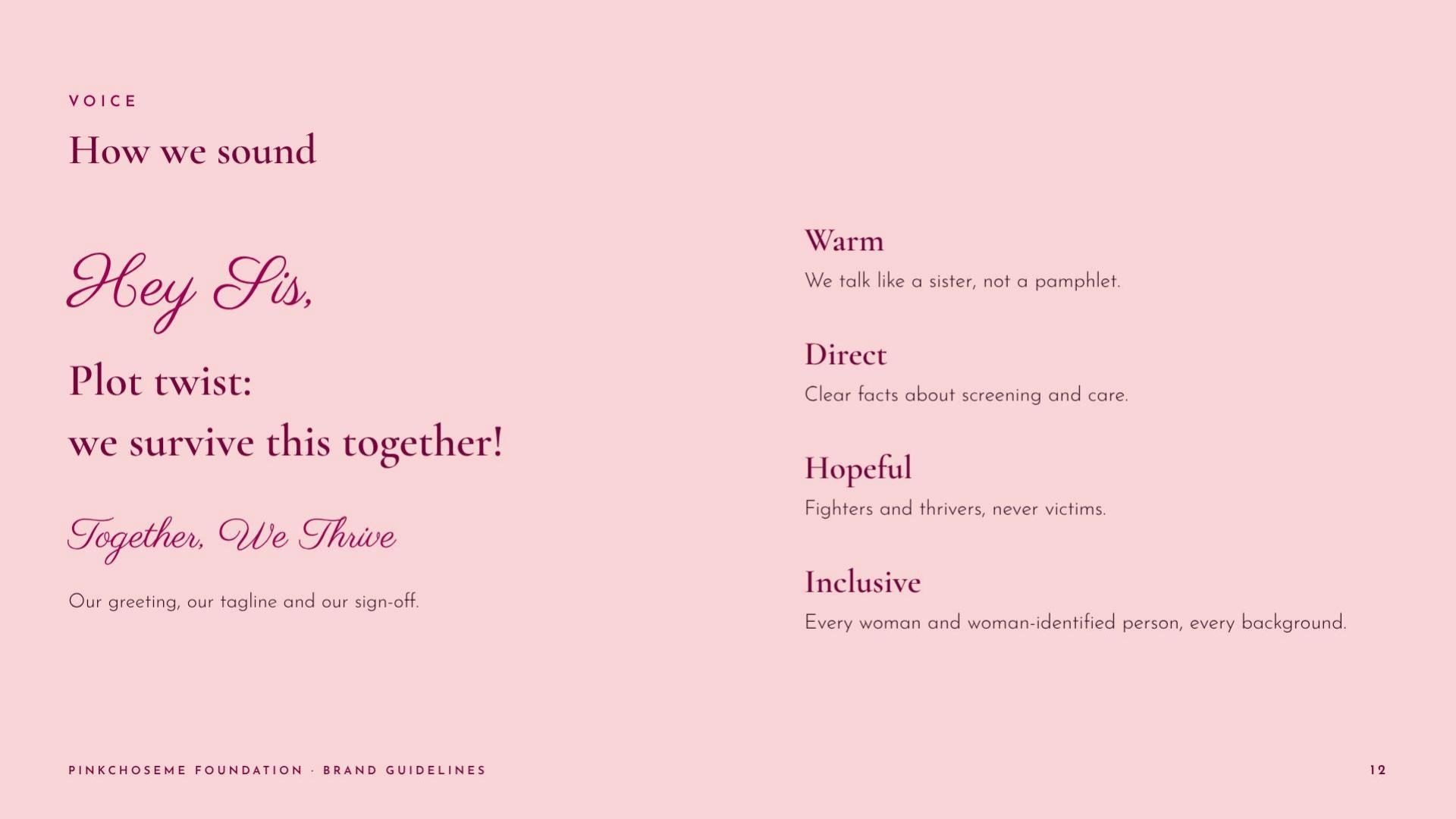
The palette was matched to the coral-leaning pinks on her website. Cormorant Garamond, Josefin Sans and Parisienne make up the type system, and the voice opens with "Hey Sis": warm, direct and hopeful. An illustrated portrait tells the founder's story without becoming part of the identity, and the whole system is documented in a 15-page brand guidelines book.
Every feather, a different shade. Every survivor, a different story.
What happened
A successful refresh
The foundation now has a complete identity: badge, peacock mark, color, type and voice, built to work everywhere it shows up.
Our widest reach yet
It launched as a collaboration post with the founder and reached more people outside our own following than any post we had published before.
More work coming next
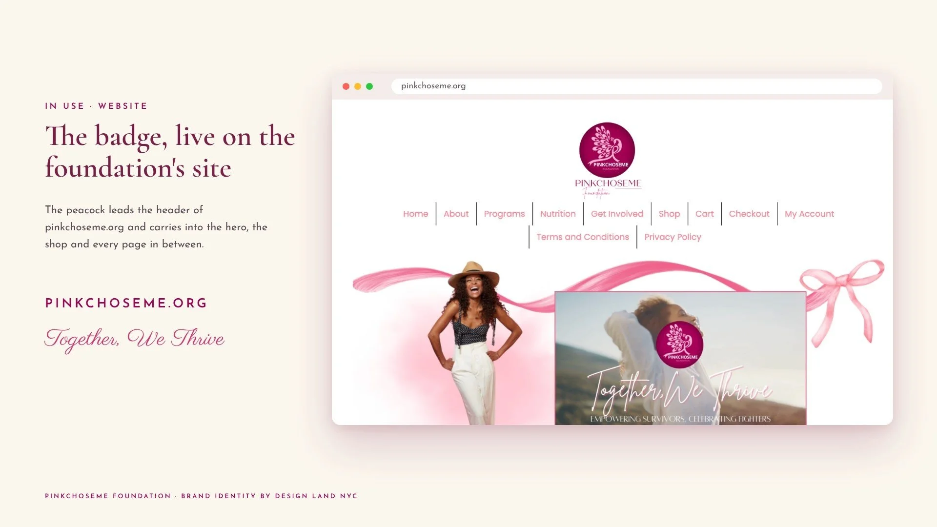
The project is ongoing. The new badge already leads pinkchoseme.org, and more work on this project is coming next.
Your turn
Have a cause that needs a brand?
We build identities people want to wear, share and stand behind.