
Argjiro's Corner: Brand Identity for a Mediterranean Food Market
As featured in SILive: Mom-owned market on Staten Island celebrates Albanian heritage
Client & scope
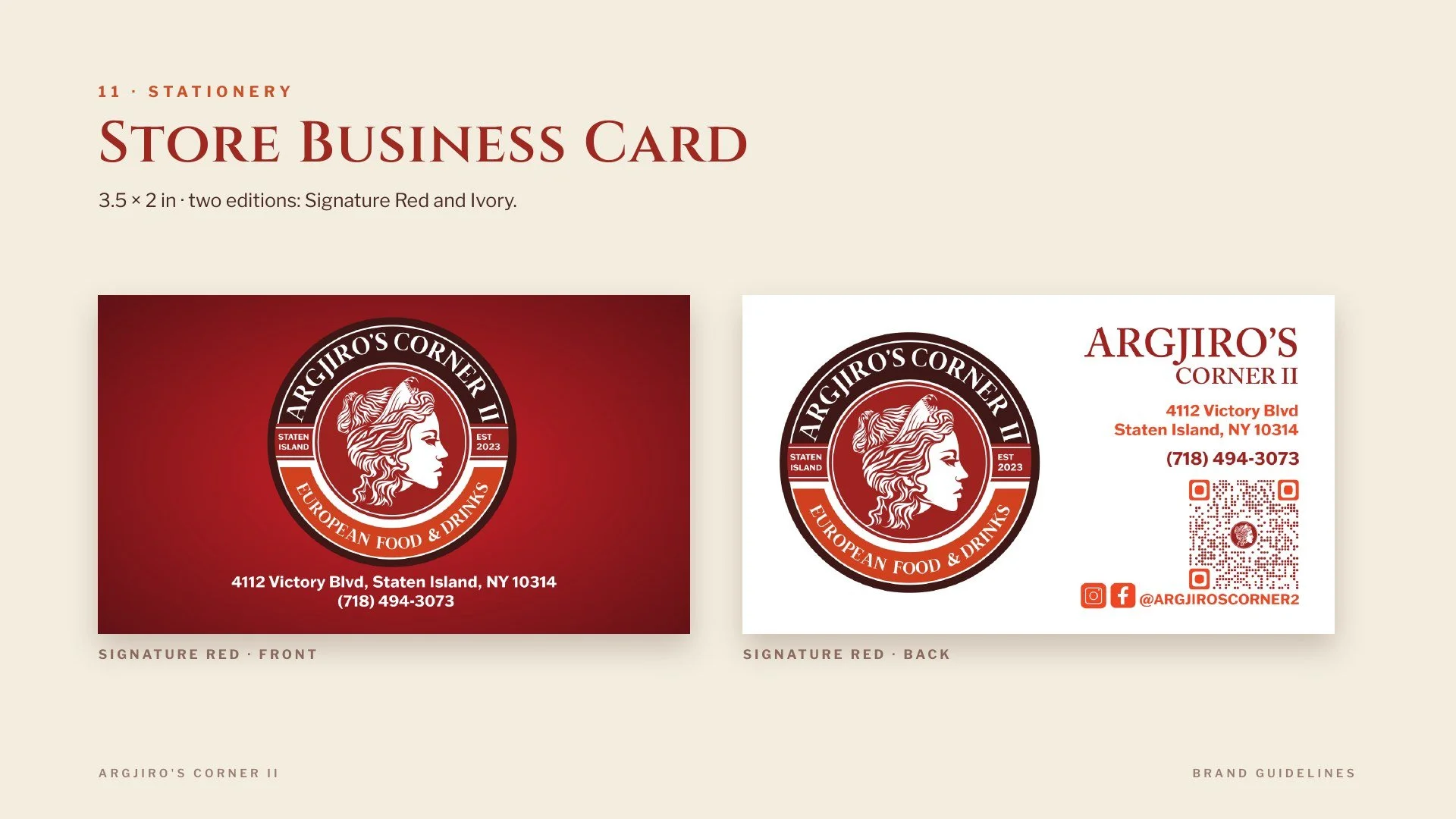
Argjiro's Corner is an Albanian-owned Mediterranean food market in New York, trading across two locations. Design Land built the brand from zero: the logo system, an earthy color palette, location-specific lockups, business cards, product and deli stickers, and a launch set of Instagram graphics with a scannable profile code.
The problem
A neighborhood food market is judged from the sidewalk, in about two seconds. The name itself carries a specific story — Argjiro, the princess of Gjirokastër — that means everything to Albanian customers and nothing to anyone else walking past. The mark had to do both jobs at once: read as genuinely Albanian to the community it was built for, and read as an inviting Mediterranean market to the rest of the neighborhood. It also had to hold together across wildly different scales, from an exterior storefront sign down to a half-inch sticker on a jar of ajvar, and across two stores in two boroughs without becoming two different brands.
What we did
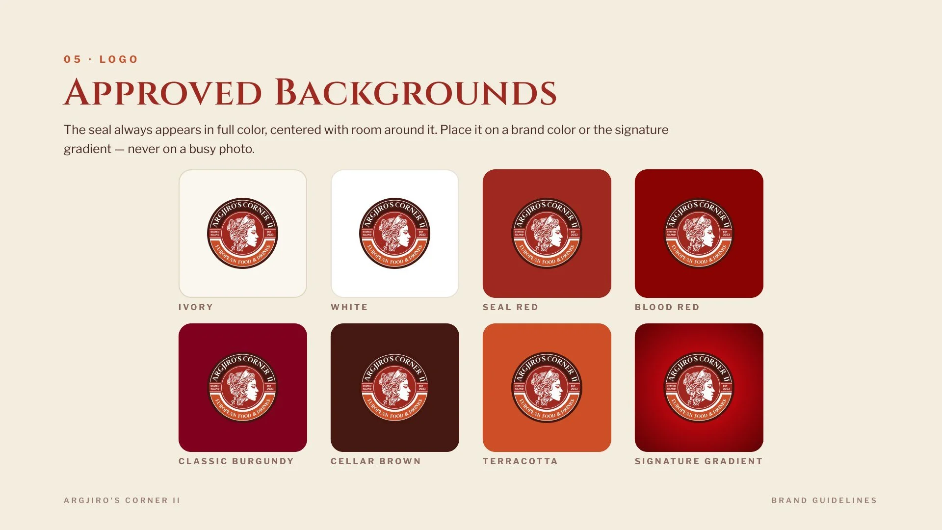
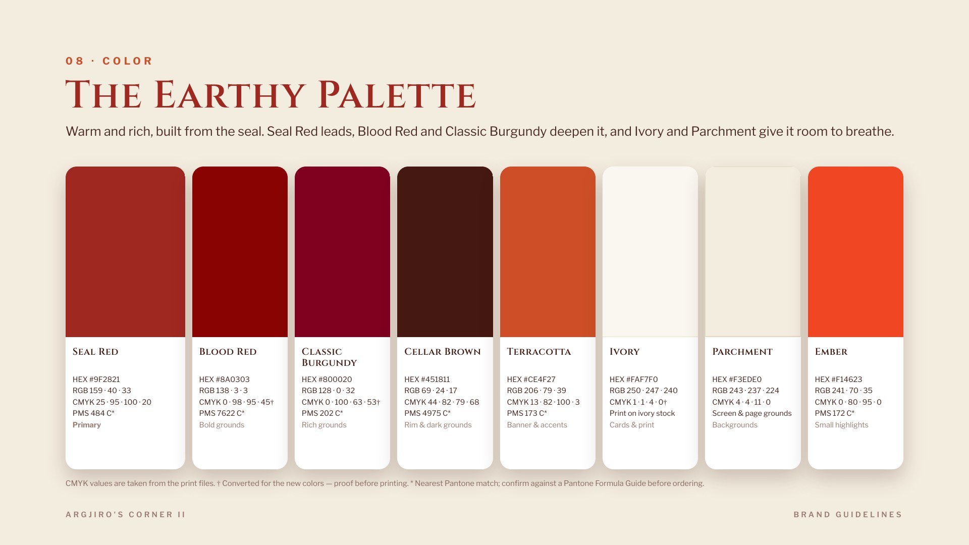
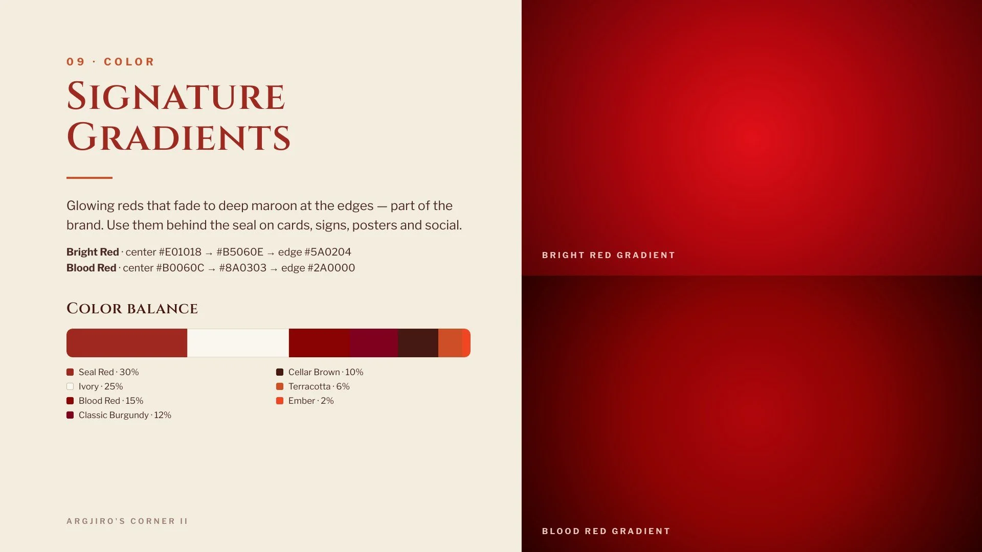
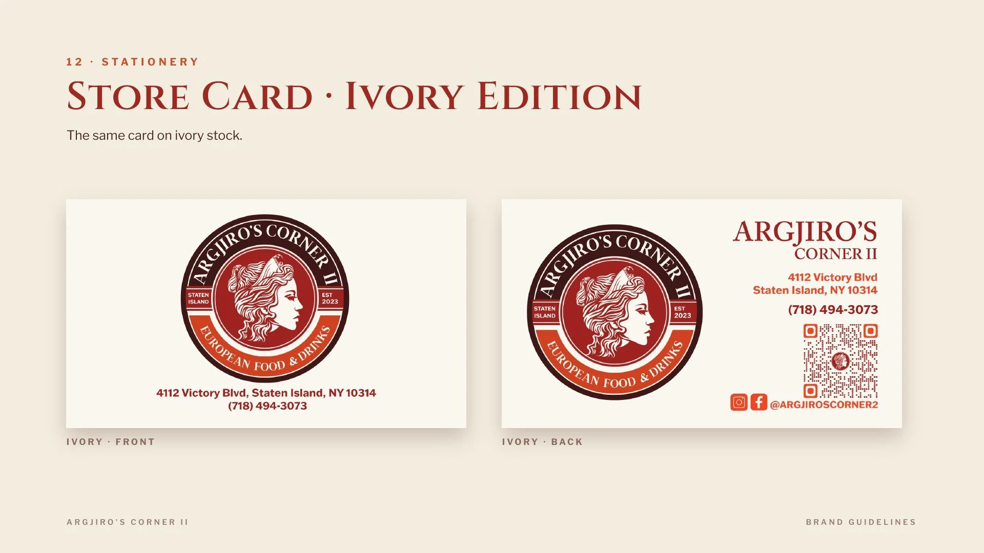
We opened the territory wide before narrowing it — heraldic and crest directions drawing on Epirote coins and the Albanian eagle, vintage circular market seals, hand-drawn retro lettering — and landed on a mark that reads as a market emblem rather than a restaurant logo. From there it became a system: an earthy palette pulled straight from the seal — Seal Red leading, Blood Red and Classic Burgundy deepening it, Ivory and Parchment giving it room to breathe — plus a signature red gradient for signs, cards and social, so every in-store piece could change without redrawing anything. One master mark generated both store lockups. The rest followed as applied pieces — two business card designs including an ivory stock, an owner's card, a sticker set sized for jars, bags and deli wrap, and Instagram posts with a QR code so the storefront and the feed pointed at each other.
What happened
The identity carried the store from one location to two without being redesigned — the second lockup came straight off the master mark, and the cards, stickers and social pieces reprinted with a change of address instead of a new brief. One mark now runs the market across the storefront, the shelf and the feed, and it still reads as the same brand in all three places. The sticker set and the Instagram kit also left the owners able to run their own day-to-day marketing — new arrivals, holiday specials, deli labels — without coming back to a designer for every post.
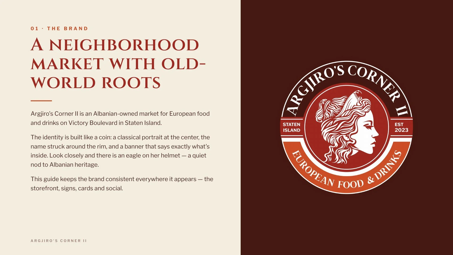
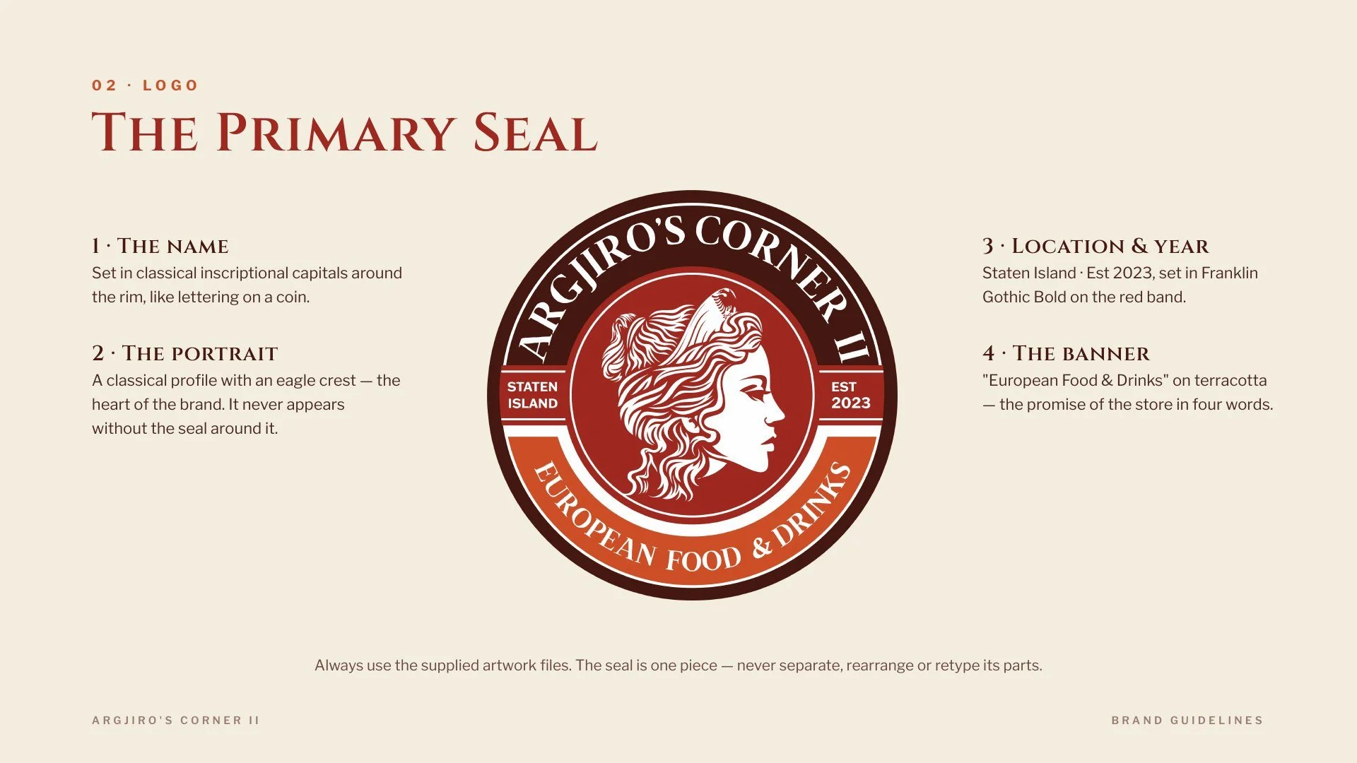
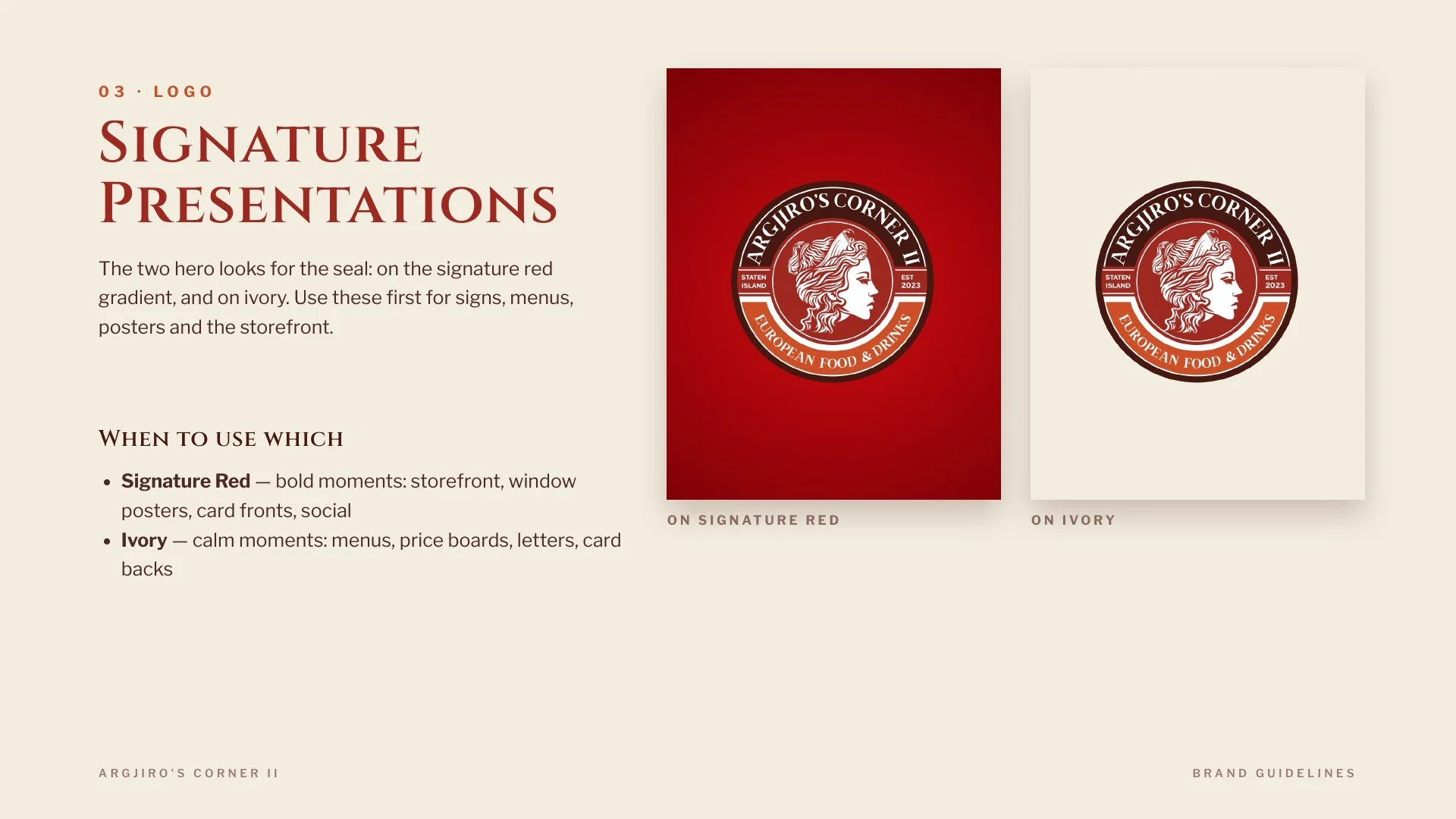
Brand, collateral and the pieces that sell from the sidewalk — from the first mark to a storefront people recognize.