Ashford & Brooks: Sleepwear Brand Identity, Packaging & Collection Design
Client & scope
Ashford & Brooks was built for an apparel vendor that wanted a sleepwear brand of its own. Designland created it from the very first word: the name came out of a single brainstorm session, and from there we designed the logo, labels, packaging, prints and the full collection.
The problem
A vendor launching its own label starts with nothing: no name, no look, no story. The brand had to feel established from day one, and it had to sell online, where a shopper decides from a small product photo in a few seconds. It also needed room to grow beyond its first category without being rebuilt.
What we did
The name. "Ashford & Brooks" was born in one brainstorm. It sounds classic and trustworthy, like a brand that has been around for years, which is exactly what a new label needs.
Logo and labels. A clean, timeless mark that reads on a neck label, a hang tag and a marketplace thumbnail.
Packaging. Packaging that presents each set as a finished, giftable product, on the shelf and in the product photo.
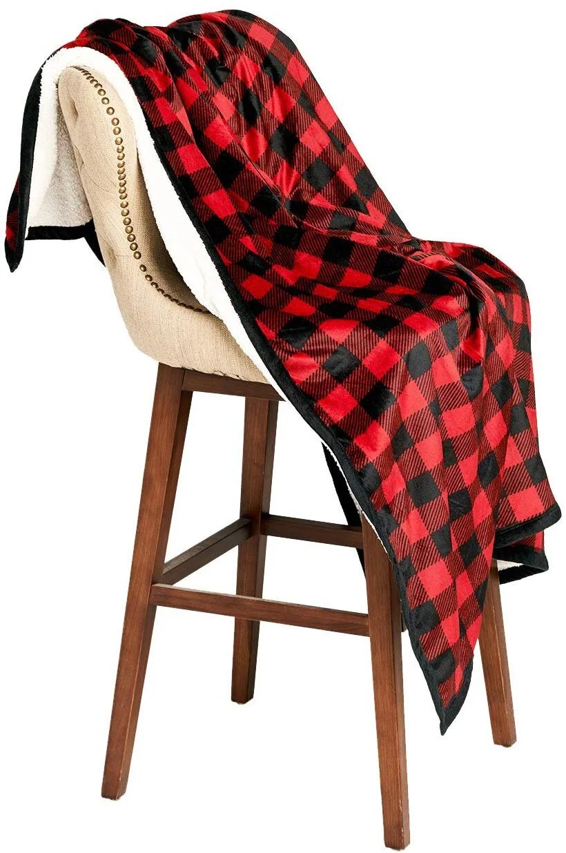
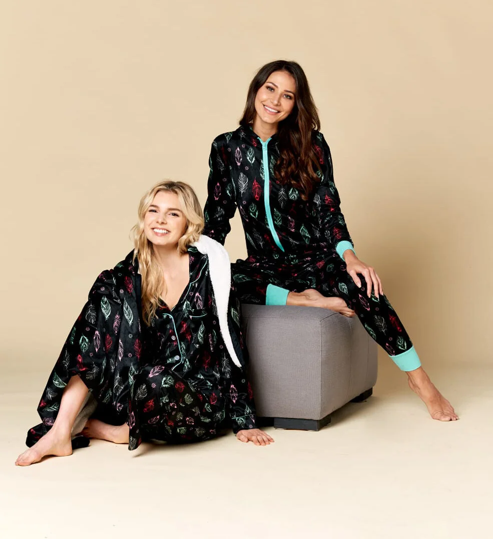
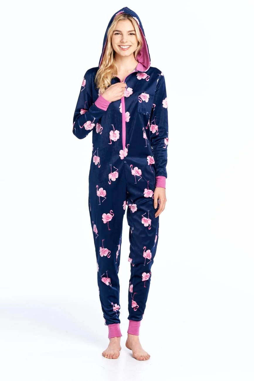
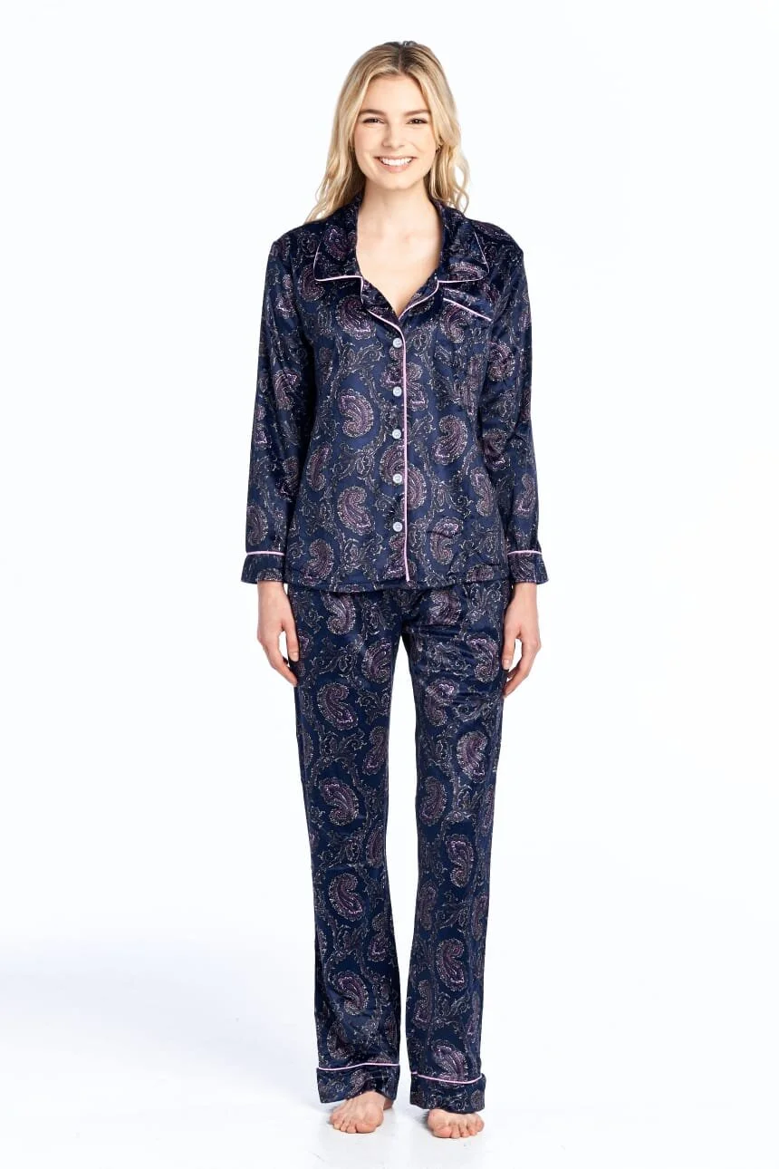
Prints and the collection. We designed the line itself, prints and all, so product and brand were created together instead of patched together later.
What happened
Ashford & Brooks launched in ladies' sleepwear, then grew into men's and children's sleepwear under the same identity. It sells mainly on Amazon and through online stores, and it has kept selling for more than ten years. That is the test of a brand system: it carried a whole family of products for over a decade without needing to be redone.
Building a sleepwear or loungewear brand? See our apparel branding and hang tag and label design services, or start a project.
Brand, product and the pitch that sells it — from first concept to the buyer's table.