APC Integrated: Corporate Brand Identity & Logo Design
APC Integrated (apcintegrated.com) is a managed IT, cybersecurity and cloud firm based in Quincy, Massachusetts, with offices in Sarasota, Florida and Europe. Since 2003 they've kept businesses running, protected and ahead of the competition, and they needed an identity that said so at a glance.
The idea
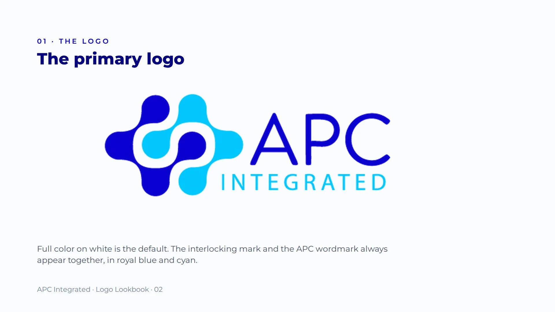
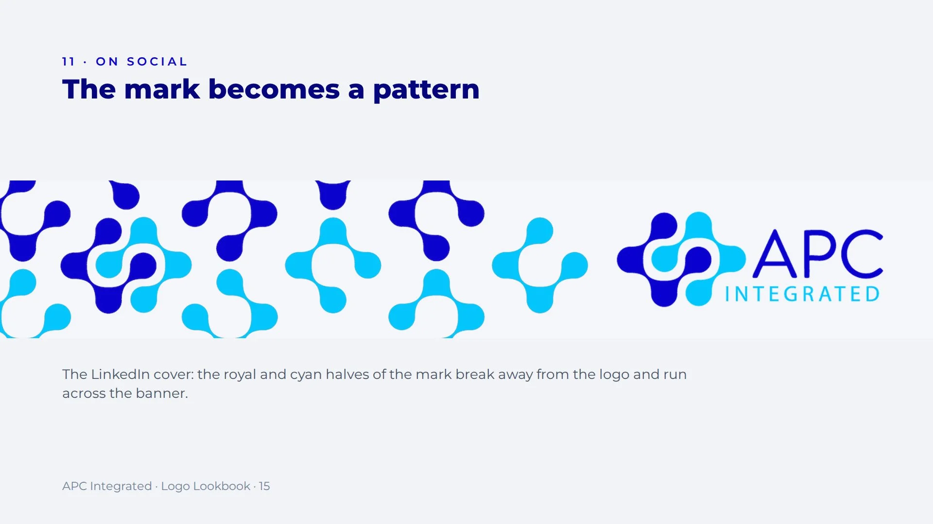
Integration is what APC sells: separate systems working as one. Designland built the mark from two interlocking shapes, a royal blue half and a cyan half, that link through the center to form a single cross. Neither half is complete alone. Together they read as connection, balance and a network that holds.
The system
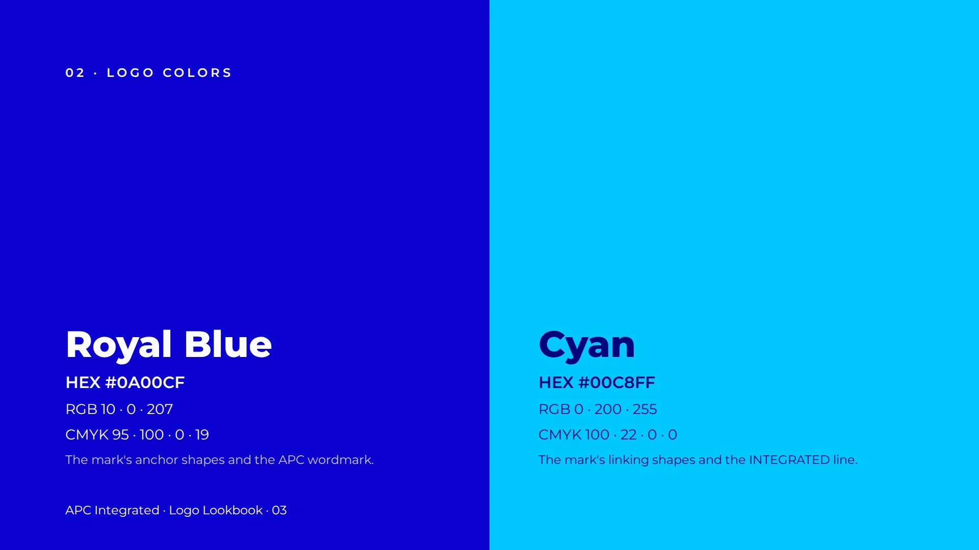
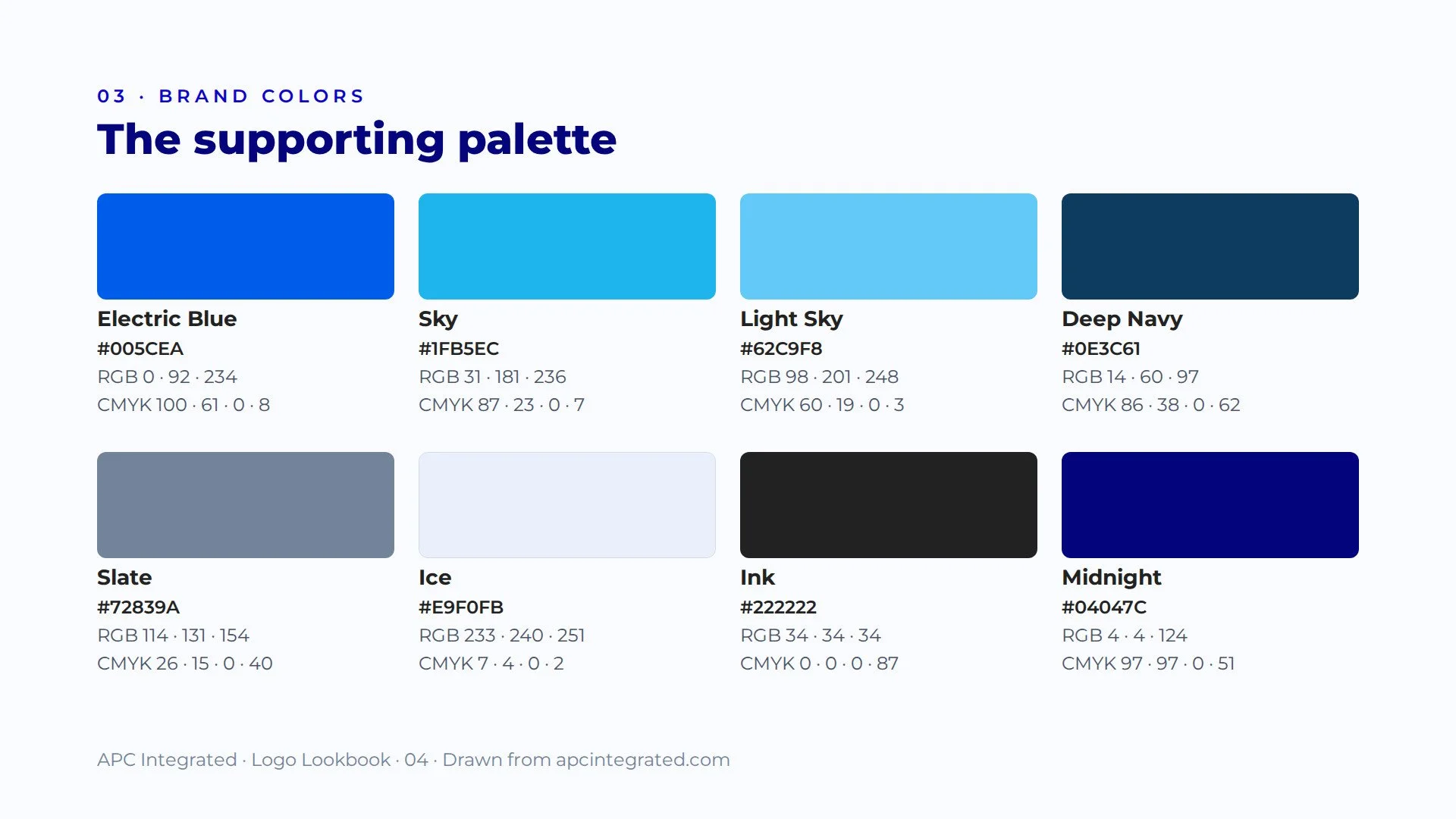
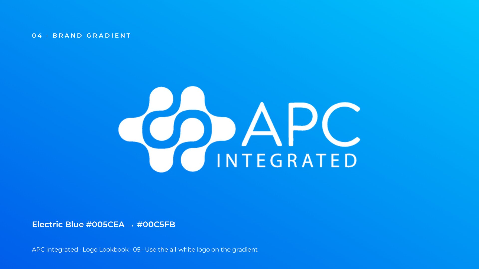
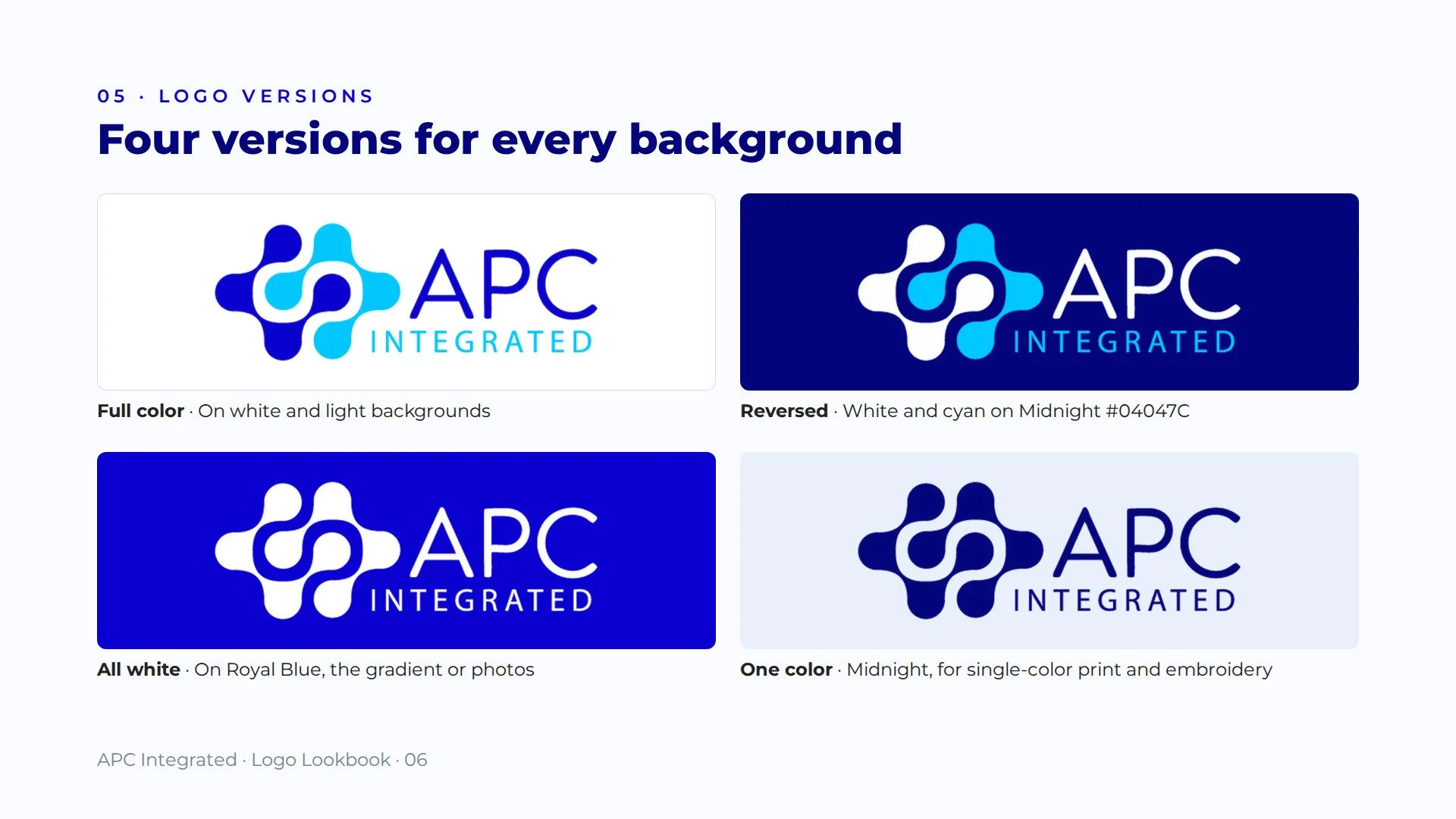
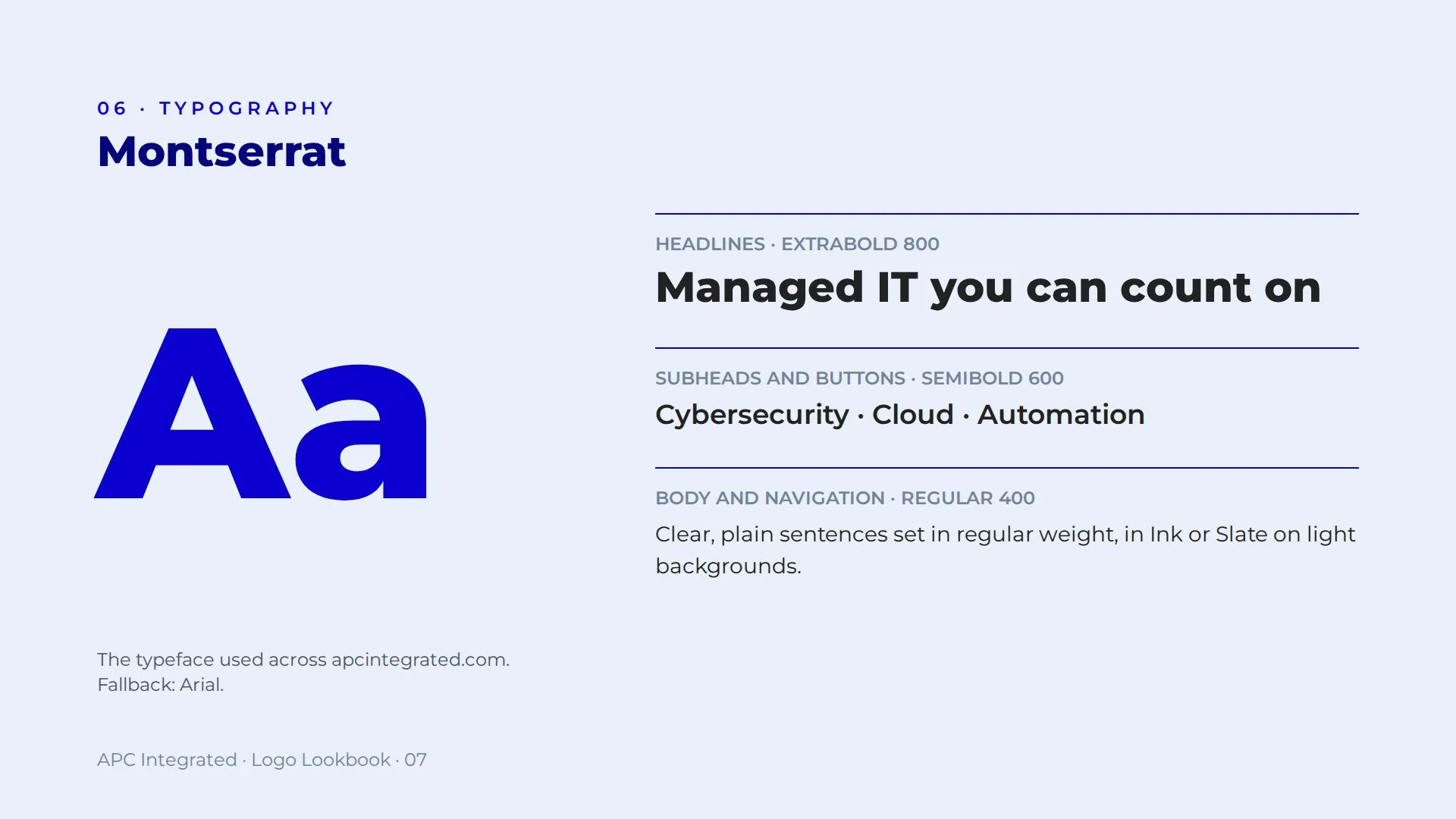
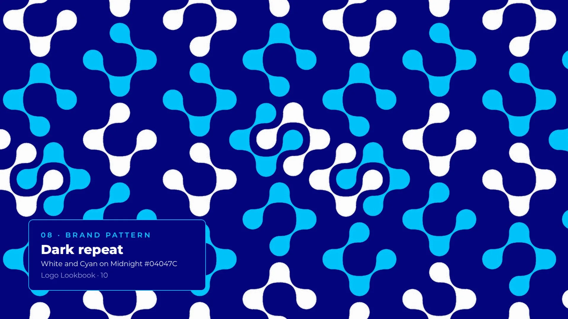
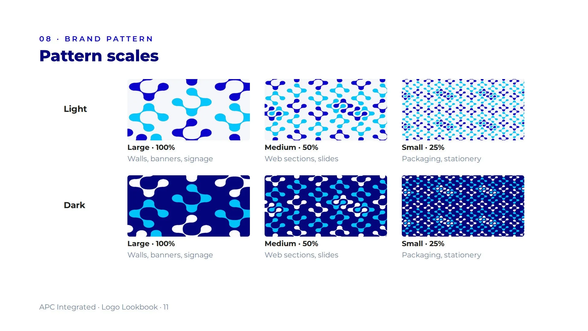
The mark grew into a complete brand system. Royal Blue and Cyan anchor the logo, backed by a supporting palette of blues, a signature gradient and Montserrat for type. The two halves of the mark also became a seamless repeat pattern, in light and dark versions, for backgrounds, banners and print. Four logo versions cover every background, from full color on white to single-color embroidery.
In the field
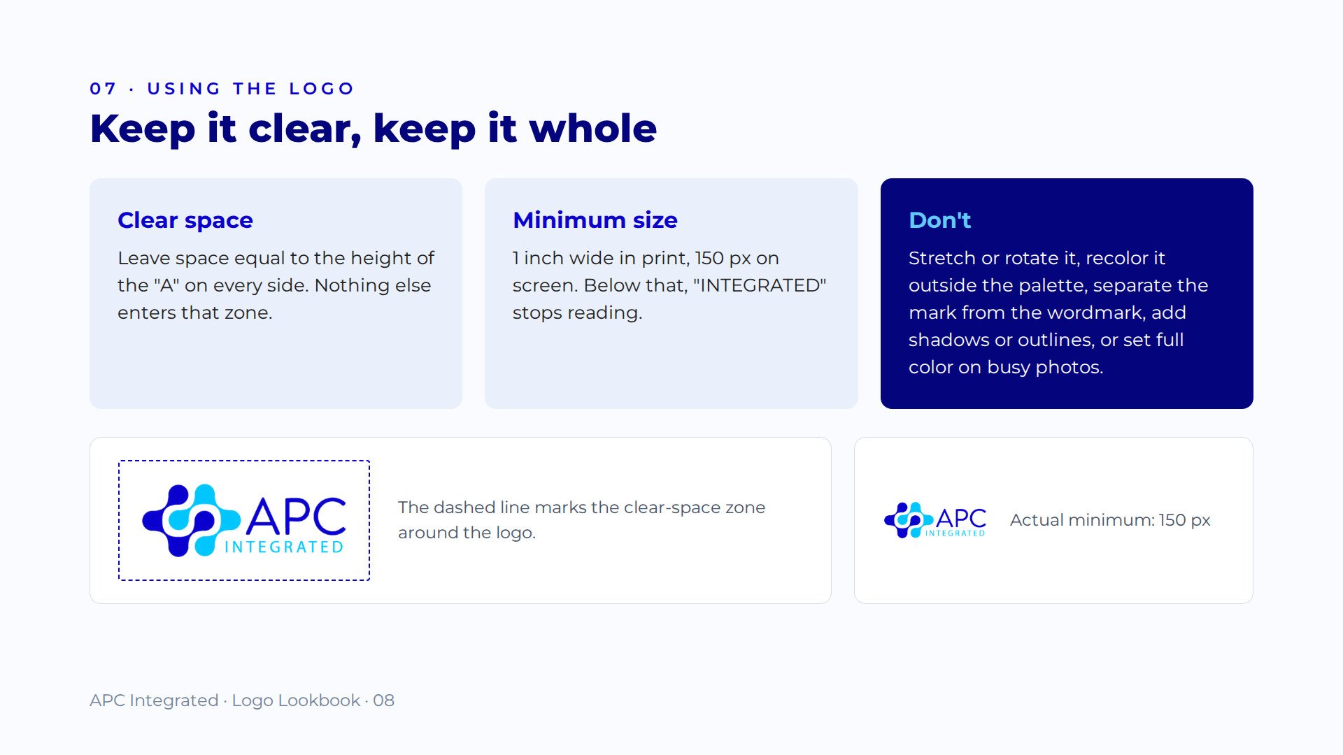
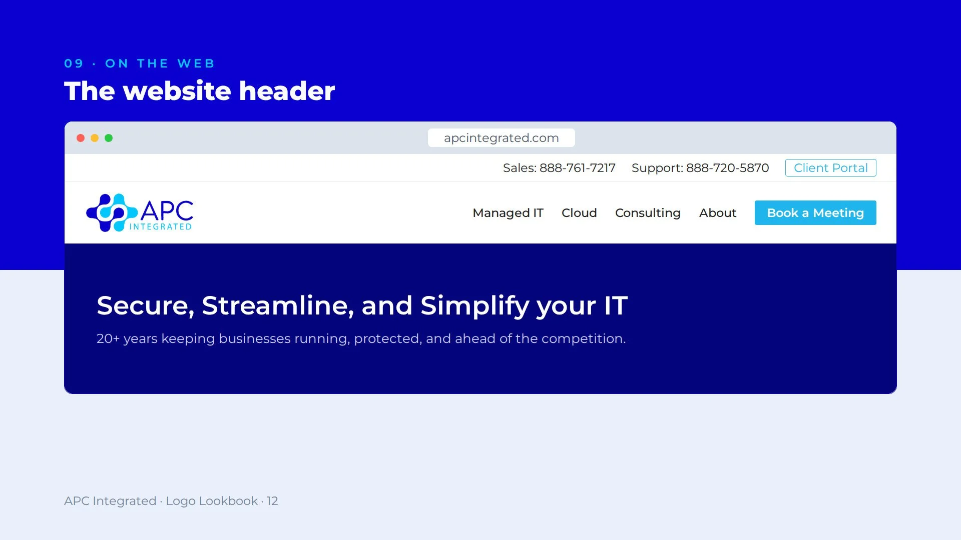
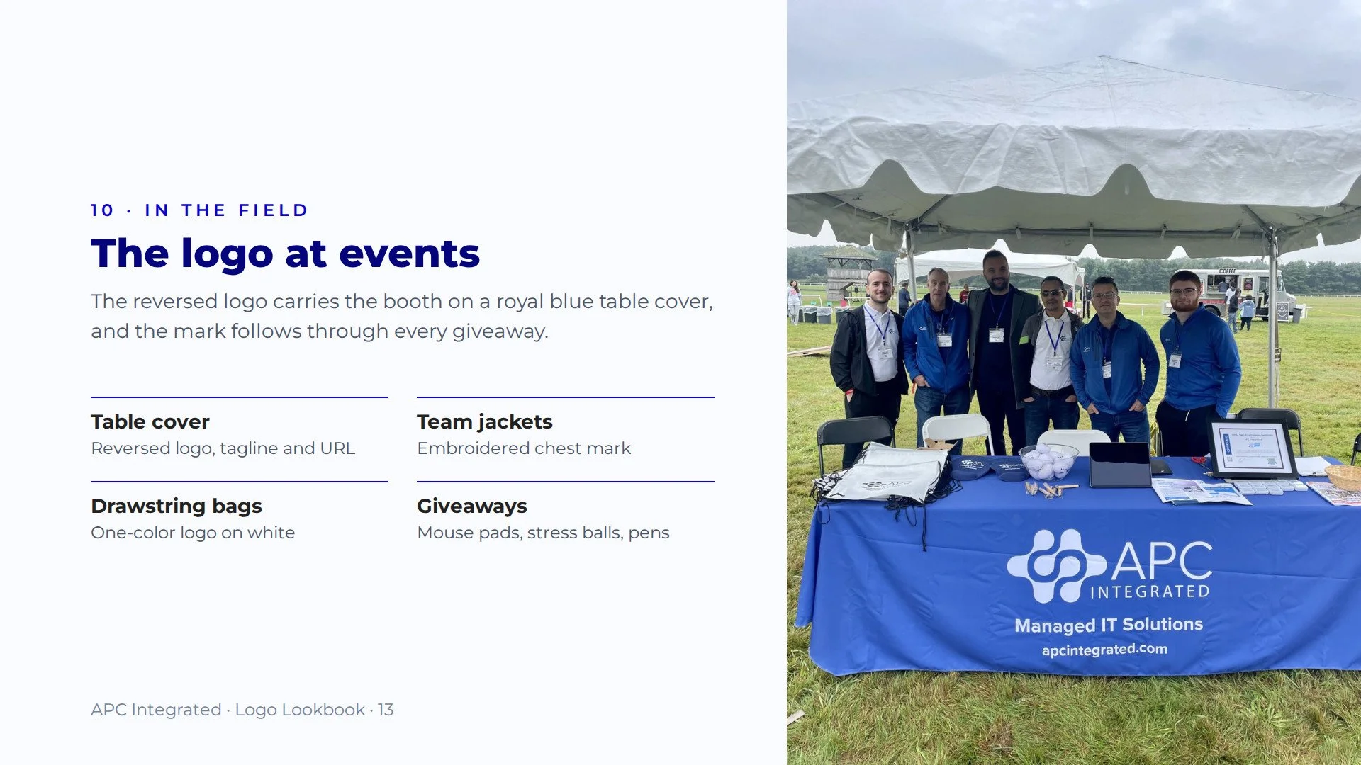
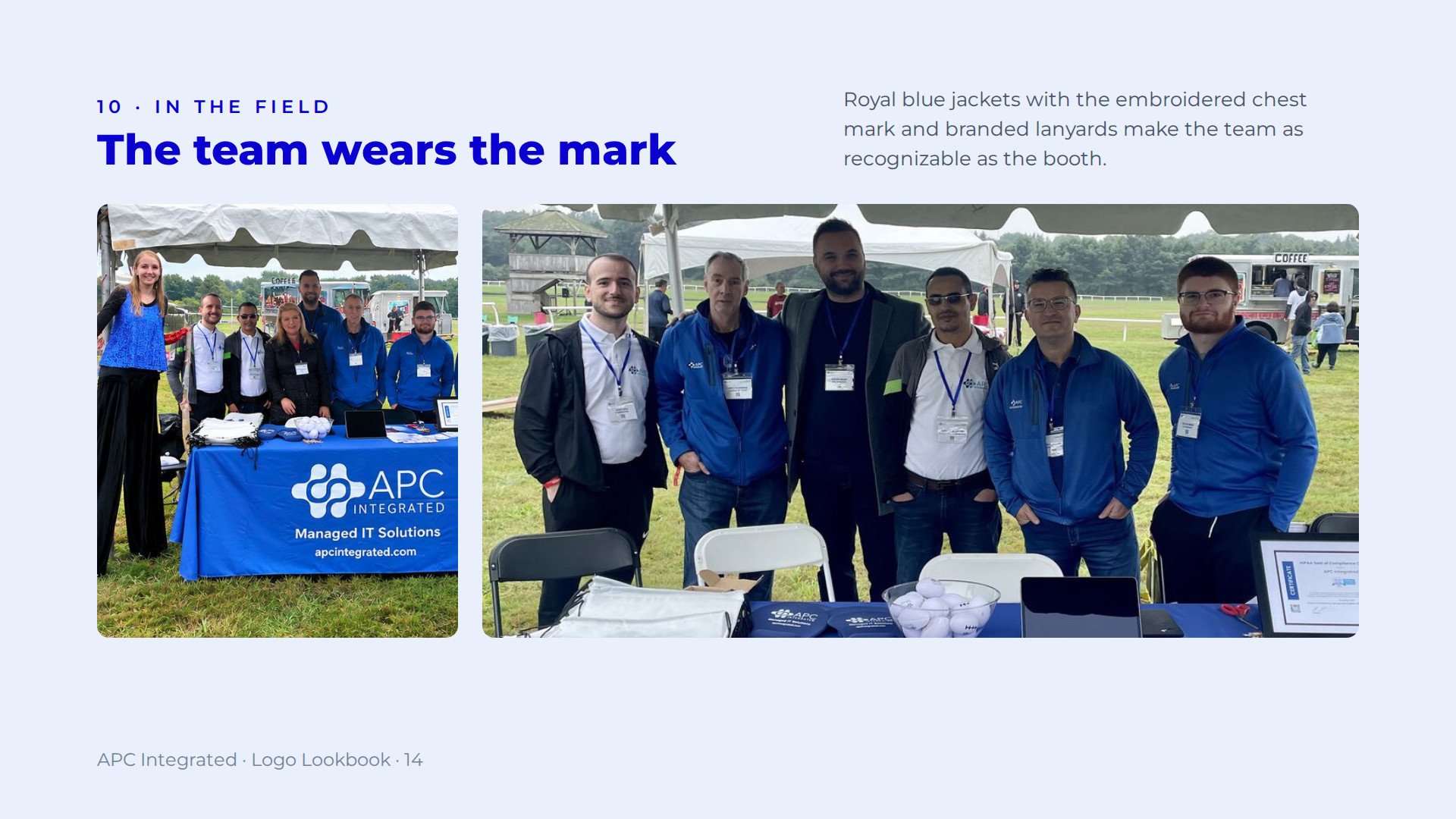
The identity has carried APC for years without a redesign: on their website, on royal blue event booths, and embroidered on the team's jackets. The full logo lookbook below documents it all, from color and type standards to pattern scales and real-world use.
Scope: logo design · brand identity · color system · brand pattern · logo lookbook
See it live: apcintegrated.com
Building an identity that has to last? Start a project →